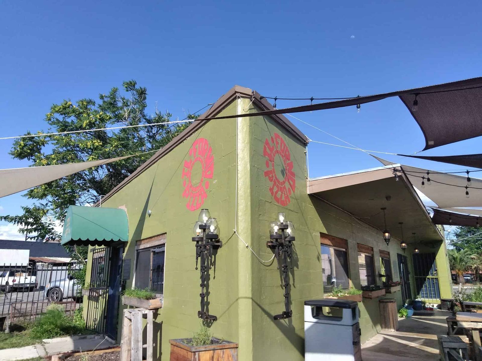
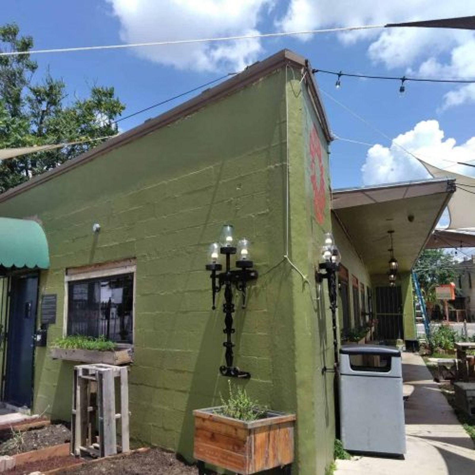
The owner wanted a faithful recreation of Ill Forno's original sign — same scale, same character, same color. One wall wasn't enough for the traffic this corner gets. We measured the existing sign, sized it up, and painted it onto two more walls so the pizzeria reads from both directions.
Close to the original in scale, dimension, and color — now visible from both intersections. Drivers coming either way can read the building as Ill Forno before they hit the light.